
WeTravel
Group Travel Website
Project Overview: WeTravel is making it easy for people to create and book group travel. Students loved their site for booking school trips and WeTravel wanted to broaden their customer base into other world adventurers. They came to us to redesign their booking process.
The Challenge: Group travel has the same challenges as other travel websites such as security questions and information hierarchy. There are the additional challenges of building a sense of community among the travelers and creating trust between the organizer and the adventurers.
Before

After

Transitioning Personas
Originally, WeTravel was designed for college or graduate students embarking on trips with their class. The school would give the students details about the trip beforehand and spaces were limited. The students we focused on getting through the process as quickly as possible to insure their spot.
WeTravel came to us wanting to open up their demographic to include a broader range of travelers. We studied the market and decided that it made sense for WeTravel to focus on an older demographic.
Lean Process
We worked lean. We tested new designs every week, saw what was working and tweaked the ideas based on feedback. In total, we tested 20 users in five weeks.
The Beginning
We selected 5 different travelers to test the original site. This enabled us to understand what was working, what was not working, and the general mindset of someone booking a group trip. We quickly learned that there are some differentiating factors between booking a solo trip vs. group travel.
Our lovely group travelers
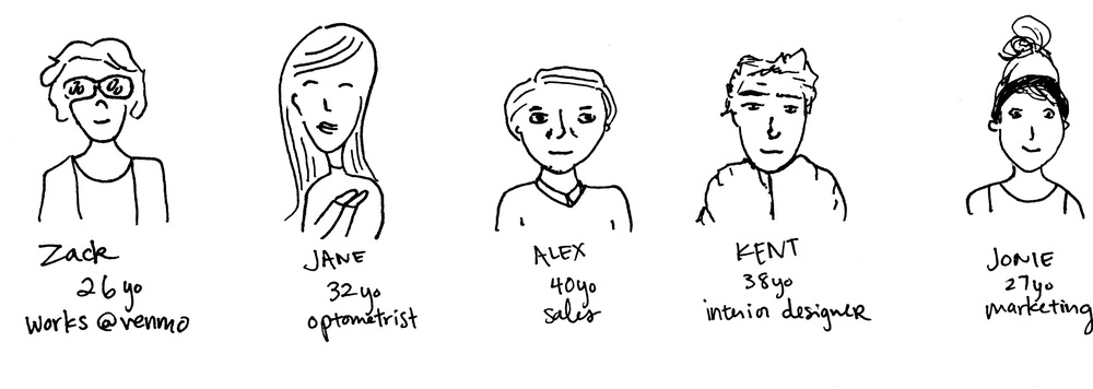
Each traveler was awarded their own color. We documented each pain point on a post it. Then we grouped similar pain points together to find trends.

This is what we learned.

Biggest Take Aways

Determining the flow
We moved information around, deleted some points but mostly we added more. We learned that to gain more trust, we had to give the user more information and detailed booking process.

Iterations
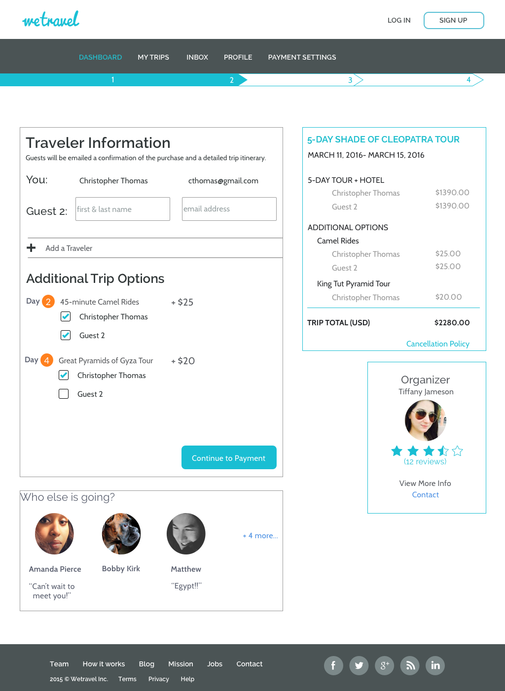
Trip Details Page
The trip's detail page was all about information. We had a lot of questions about how the users wanted their information formatted. What facts were the most important? What details were delightful? What information was a deal breaker? Through testing, we learned that the organizer information was the key to earning the traveler's trust.
Low-Fi
Mid-Fi
2nd Mid-Fi
Traveler Details Page
At first, we tried to combine the travelers details page with the payments page to try to consolidate the flow and then through user testing, we learned the benefits of longer flows. One of our main goals was to make travelers feel like they were joining a community. By creating an individual Traveler's Detail page, users felt that they organizer really cared about their needs.

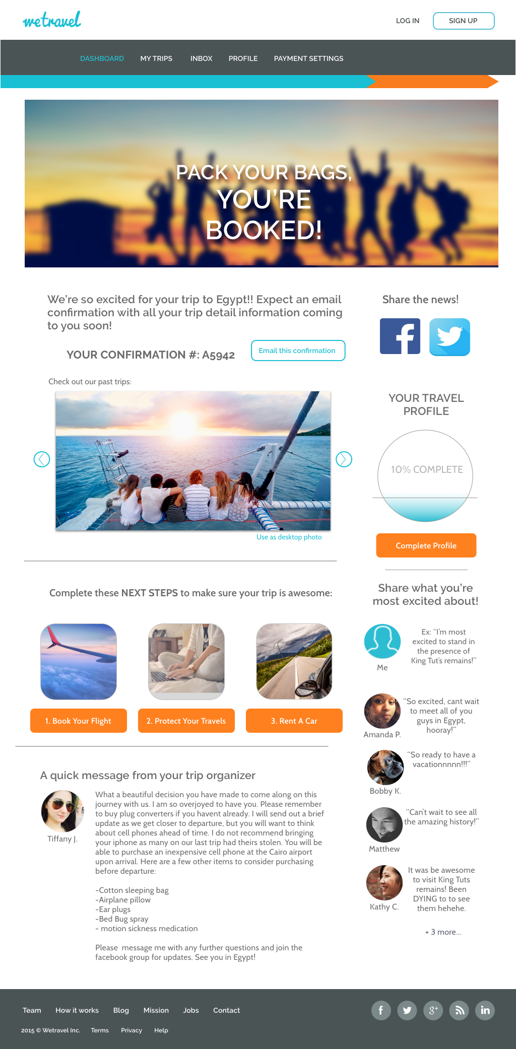
Confirmation Page
The original site had a really boring confirmation page and users wanted more information about the trip. The travelers upselling features were also part of WeTravel's business plans and need to be more dominate. Our first goal was to create a sense of community to make the user want to interact with the page and get excited about their adventure. Then to make the upsell information feel like it was part of the traveling experience.


Final Product
After all of the user tests, we finally had a finished booking process. Hooray. These are just a few of the finished pages.


Click here for the final prototype.
Further Insights


Validation Testing Showed

Recommendations for the next phase
The users' connection with the trip's community created the most excitement. For the next sprint, experiment with different features to enhance the community.
We observed that users wanted the itinerary to be further broken down. This would effect the organizer's flow and therefore, was out of scope for this sprint. For the next round, interview the organizers to see if they would like to further break down the itinerary.
Users requested other payment options such as Venmo and Squarecash. I am sure new payment methods are going to quickly appear. For the next sprint, survey how the users want to pay.
More Case Studies: