
Streamloan
An iPhone App
Project Overview: The best part about being a renter is that I have never had to go through the mortgage process. Luckily tech is disrupting the mortgage industry and Streamloan is leading the way with their easy to use app that coordinates documents between the home buyer and the mortgage agent. They recruited my team for a top to bottom re-design.
The Challenge: The mortgage industry is very, very, very complicated. Our goal was to make it effortless.
My Role: My team of designers studied the design of the app holistically and then broke it up into pieces for designers to focus on. I focused on the accounts' pages with my partner, Ben.
Before


After


Personas
Streamloan is designed people who no longer write checks, and use their phone as their wallet, personal assistant and computer. After doing some research, we realized that the product was slightly different for people in various stages of their life so we made two personas. First, Jeremy is buying his first house as a millennial and has grown up surrounded by tech so he doesn't even know how bad the mortgage process use to be. Kate is a super mom who has had a painful previous experience with buying a house. Her biggest fear is to waste her valuable time when she could be playing with her kids.


Usability Tests
I joined the team at a later stage so I did not conduct the usability tests. I did rely heavily on their insights when redesigning the flow and the interface.
The team had an existing app which gave us a great jumping off point. We conducted usability tests to help uncover users' painpoints. Usability tests are helpful to determine what the user expects to see. It is easier for a user to say yes or no to a physical flow than to describe the process.

We prioritized 6 pain points and here is our check list
- Adjust the colors, tone, look and feel of the user interface to convey StreamLoan’s core values of security and simplicity
- Redesign information hierarchy to provide the user with clear direction
- Provide clarity around the account and bundle process.
- Minimize cognitive fluency (the amount of effort a user thinks is required to complete a task).
- Design and implement terminology and icons that make sense to the user
- Reduce duplicate functionality
Information Architecture
After looking at the app holistically, pinpointing the necessary features and then breaking down the task flow of each feature, we came up with a new framework for the app. We were able to eliminate some features all together and reduce the number of screens that the user had to go through to do a task. We did add features that helped the user navigate through the app such as tutorials and a way to contact Streamloan.


We filled white boards full of potential ideas and ended up with a cleaner flow showed below.
Before
After
Design Studio
We got out all of our art supplies of stickers, sharpies, paper, and post-it notes and cranked out some possible screens. We had a design session of intense crazy-8s. Voted, iterated, voted, iterated...we did this for a while until we came up with some solid ideas to jump into wireframing.

Wire-Framing
These are just some wireframes for account's screens. My main goal was to clarify the navigation and comprehension of actions.


High Fidelty
Before we jumped into high fidelity, we conducted a branding workshop. We came up with 5 brand identities that guided our designs: Trustworthy, Streamline, Lightweight, Guidance and Personal. We created a branding guide that contained a component library, color schemes, and font choices. This process made it easier for us to level up the wireframes to high fidelity.
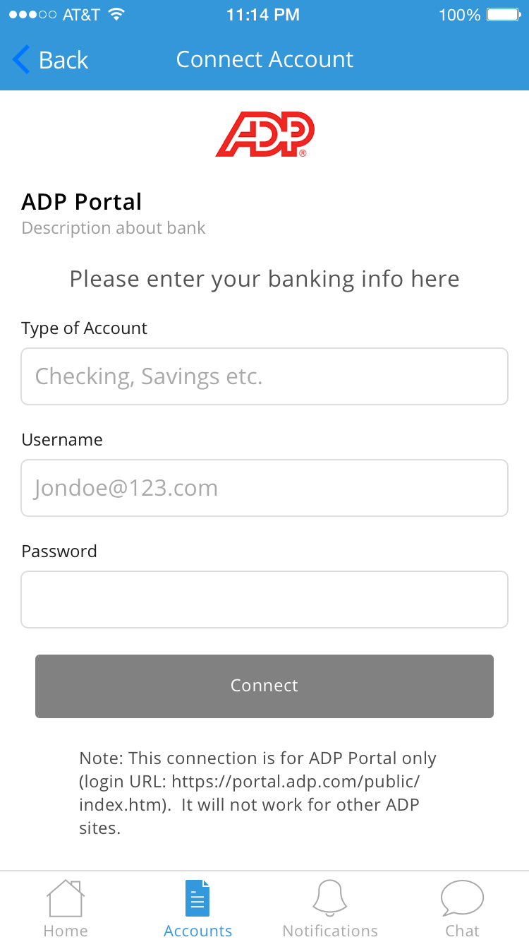
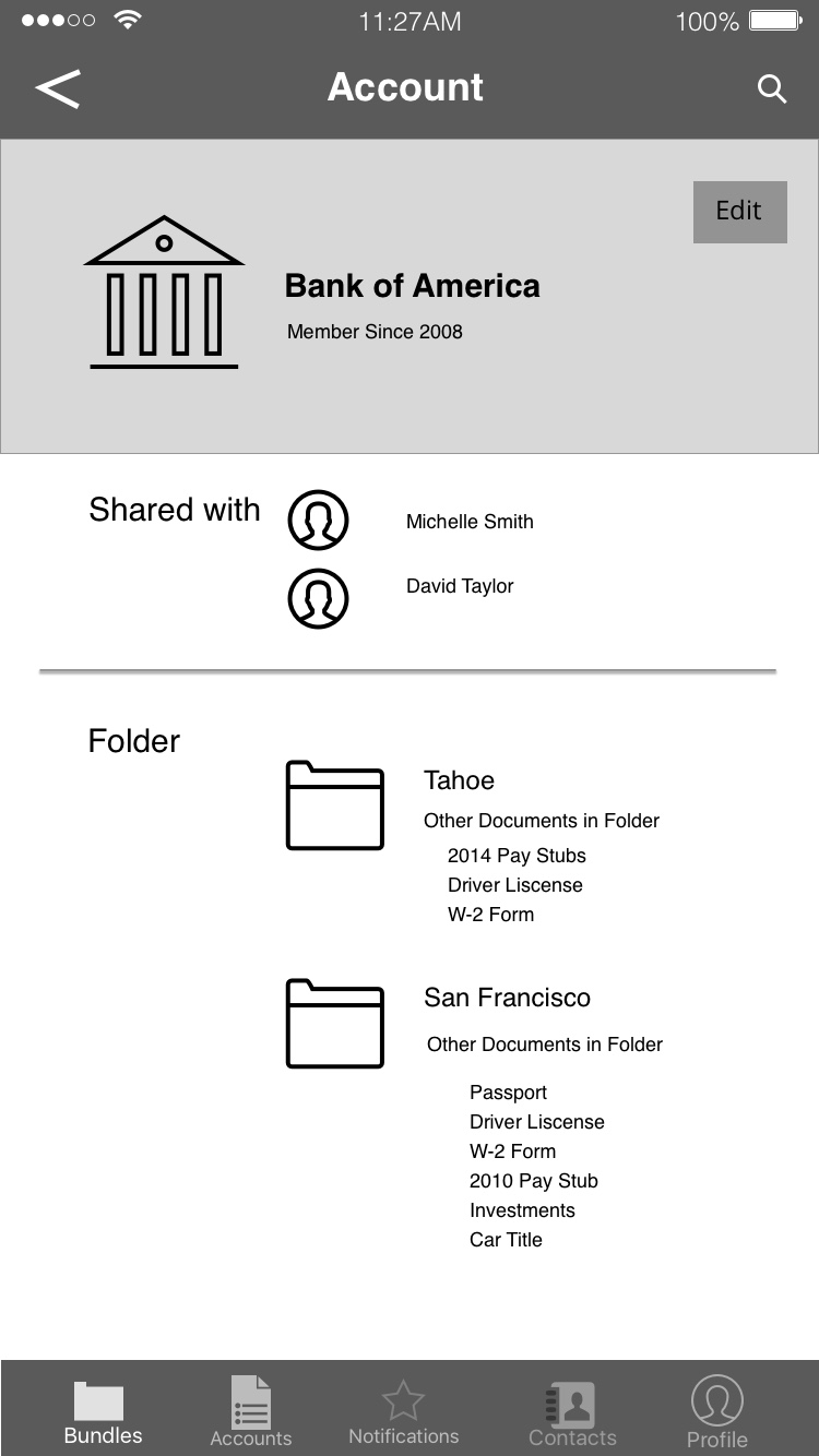
Diving Deeper Into Accounts
I focused on the accounts' pages. The accounts feature allows the users to select the different bank accounts, previous loans and identification to go into a mortgage application. Streamloan has a long list of potential accounts that were easy to import to the Streamloan app. A user can also choose to manually input data for an account that is not on the list or something more personalized like a driver's license.
Results
We conducted 6 validation test to see what the new users think of the redesign. It confirmed the UI changes and that users felt more secure due to the new design. We also found new pain points related to the new flows and are working on tweaking the designs.
Streamloan is currently in the process of implementing our designs. As the app evolves, the team can use our style guide to continue updating their designs. They are also using the iPhone app to create an Android version.